"Silhouette"
Silhouette - Each board is 30cm squared, 3x4 different coloured soles, 6x with legs and 6x without legs, all connected with a continuous line. This piece brings together a large proportion of my aims for this project. The 6 paintings with legs included show that the shoes have a purpose, a meaning, and are owned. It also gives them a ‘place’ in the grid. The shoes which are not being worn can be classed as ‘unclaimed’. I’ve been inspired by Andy Warhol and his grid-like forms for the layout of this piece. The reason that there are multiple different colours for the shoes soles is that the audience may perceive the difference between the expensive red soles and the possible lower priced green, blue and purple soles. Consuming what we purchase is another idea that we may purchase what we consume, therefore, depending what shoe we purchase it tells us something about us. The juxtaposition between the possible prices of each pair of shoes next to each other is almost like a simulacrum, as the difference between them is not obvious. The shoes also take a nod at iconography as they are a very representative form. The line signifies that all of the shoes are connected in some way, obviously through the fact that they are a shoe but also in a consumer type way. Having some shoes which are owned and some which are unowned (in terms of the legs) is quite important, considering the squares in a grid-like form are almost an advertisement to the people viewing.

For Sale 1

For Sale 2

For Sale 3
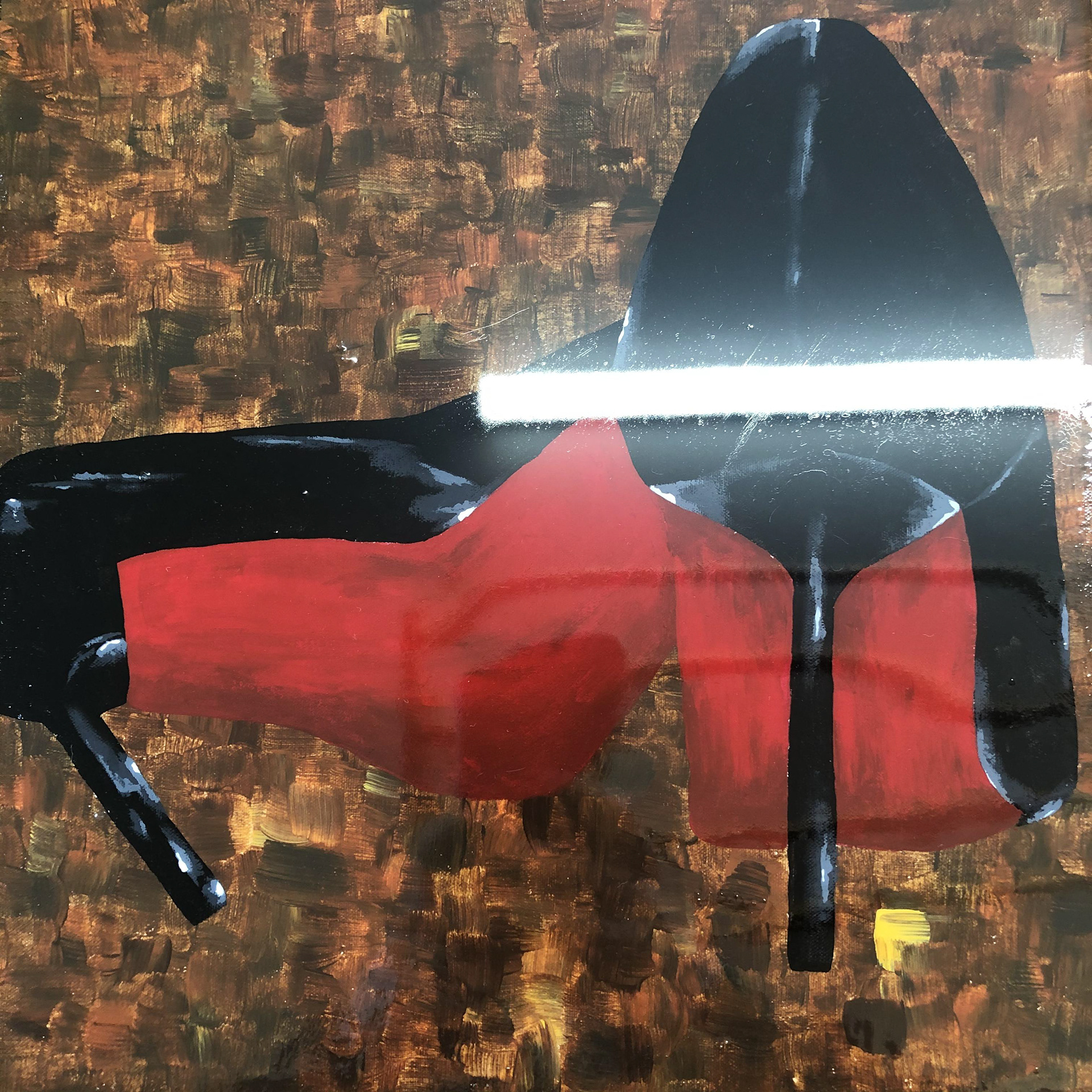
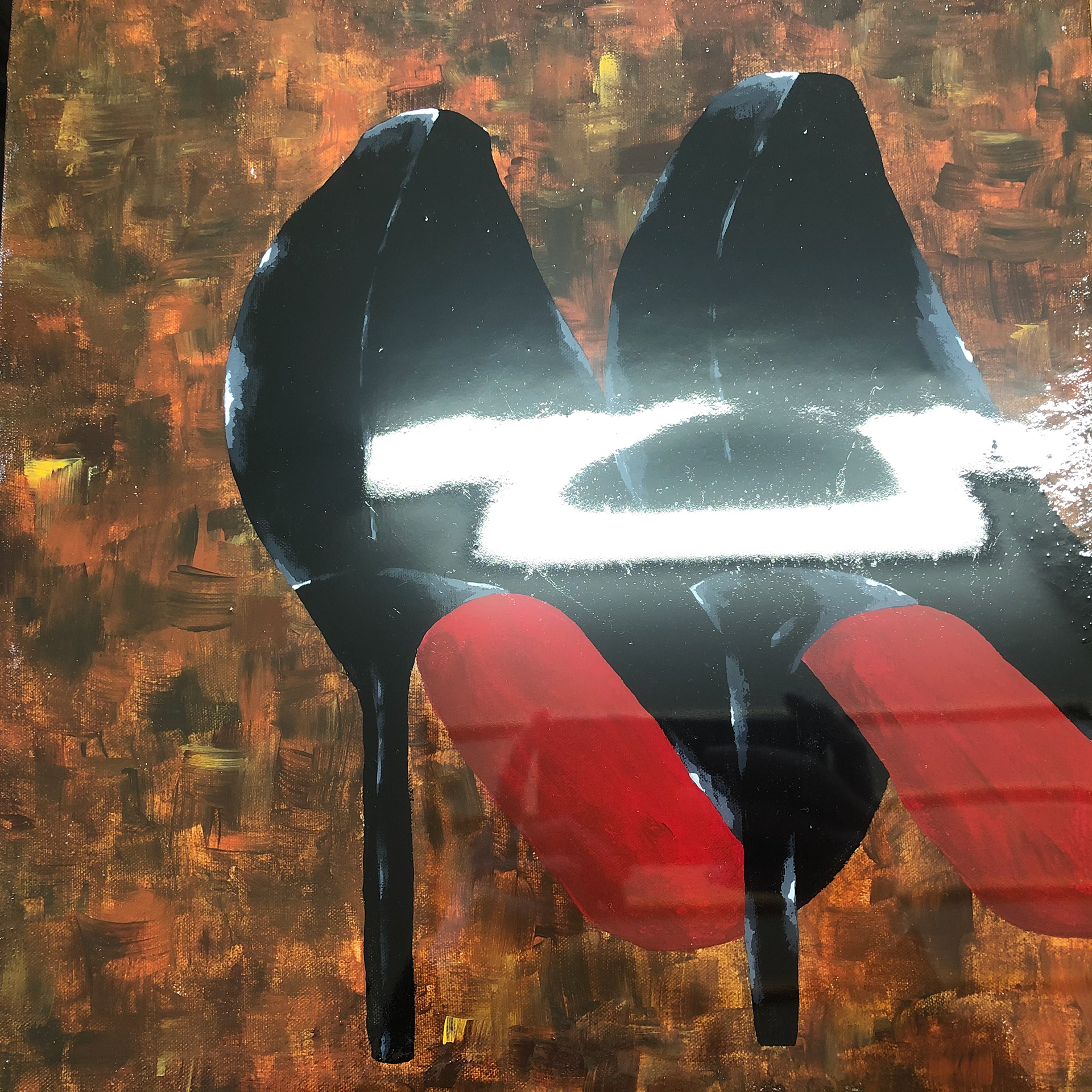
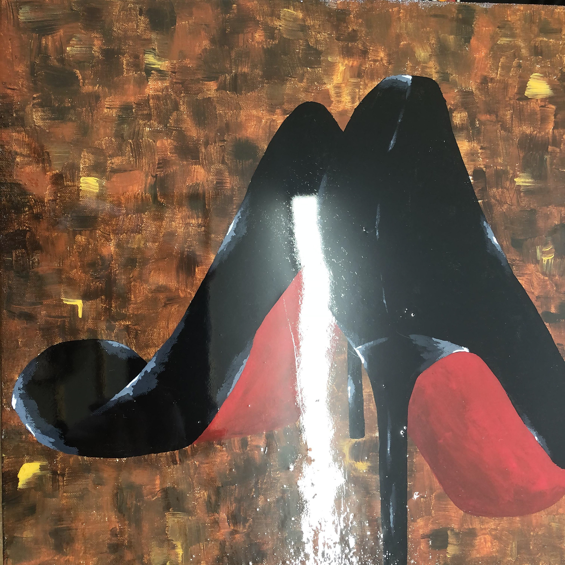
"For Sale"
For Sale - This series of 3 canvasses of the same pair is of shoes from different angles. I have used an epoxy resin layer over the top to give it a brilliant shine which reflects all lights and shadows. I imagine these images being in a shop window as part of an advertisement. The shine pulls you in and draws your attention, while the shoes stand out against their background. The photographs taken have been purposely exposed to a bright white strip light to show off the shine.
"Catalogue"
Catalogue - This piece is inspired heavily by Lisa Milroy and her grid-like forms. I decided to use flat colours, inspired by Gary Hume, to make a form of advertisement. I’ve named this piece ‘Catalogue’ as it is almost showing this singular pair of shoes from every angle. I’ve used a wood varnish over the top to give it a sheen, linking towards the advertisement side of this project. Like in magazines and catalogues, the idea of having the item from multiple angles, with a slight shine is very inviting to the consumer. I have stripped back the shoes to their basics outlines and shapes, which continues with the theme of iconography, as even though it is very bare, the audience can still see and make out every shoe.